Individual Product Print Summaries — something to hand a client.
Advisors needed a clean, branded document they could print and walk a client through. This is the research story behind Canada Life's product print summaries. From the starting point of scattered legacy portal printouts, to a first version rollout of the summary and the feedback it drew. Ultimately leading to a streamlined version two summary, delivered alongside the newly redesigned product details UI.
- 33
- Survey participants
- 6
- Remote interviews
- 8 → 2
- Pages per summary
- 2
- Versions shipped
Why advisors need a printed overview of a client's various insurance and wealth policies
- Advisors need something to be grounded around in meetings.
- Clients want to see regular updates.
- Some older clients have technical limitations and accessing digital portals or files is a challenge.
- A printed summary builds trust by keeping the client informed.
- Advisors want to service high value clients directly, instead of referring them out to online portals.

Initially, financial advisors using Canada Life digital products had to go to various destinations to get their wealth or insurance policy print summaries. This caused them to have to navigate different portals and hunt around to find what they needed.
Version 1 of our product print summaries brought that functionality into one central spot, inside Workspace, but it was met with various points of feedback.
Allowing access to the print summary was a win, but we listened to feedback and used that data to enhance the summary. We took initiative and moved forward with an enhanced Version 2 of the summaries that addressed these concerns.
Research overview
- Where the journey began
- Early product print summary research
- Introduction of Version 1 versions of print summaries
- Feedback received
- Introduction of Version 2 of the print summaries
- Exciting next steps ahead
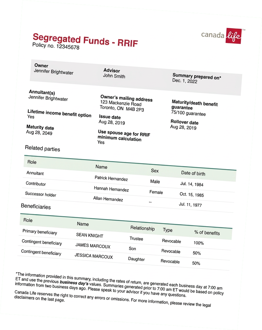
Summaries came out of whichever insurance or wealth portal happened to hold the policy. Different sources, different brands, different layouts — printed and handed to a client as-is.

Goals
- Understand the current pain points and needs when exporting financial product information.
- Understand users' expectations when exporting a policy summary from Advisor Workspace.
- Validate and gather feedback on the product summary export concepts.
Methodology
- Remote interviews were performed with advisors and operational staff across Canada.
- Each session was scheduled for 30 minutes, including interview questions and open discussion.
No access to information
Some product details are not available on any portal, making it difficult and time consuming to get access. In some instances advisors or operational staff need to call the service centre to request the information.
Unprofessional looking printouts
Printing from multiple sources and brands creates a hodgepodge of different looking documents that appear outdated and unprofessional.
Inconsistent customer documents
Some offices gather all the information and create their own branded, consistent package. Most offices don't have the time to build these manually, so they are stuck with what the advisor portals produce.
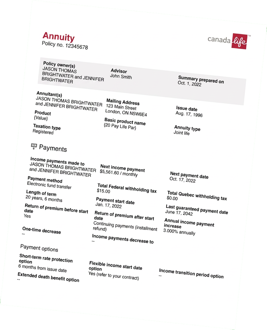
Overall, participants had very positive feedback about the summary export concepts. They found them clean and easy to understand, and felt they looked professional and better aligned with the Canada Life brand.
“Clean and not cluttered, I really like the look.”
“Move some of the information to the first page so we don't have to flip through pages to find the information.”
- No access to information
- Unprofessional looking printouts
- Printing from multiple sources & different looking documents
- Inconsistent customer documents
Goals
- 1. Uncover the necessity to share product details.
- 2. Understand the gaps left if there is no replacement for summaries.
- 3. The differences between sharing individual details vs a summary of all products.
- 4. Which individual summaries are more important than others, and why.
- 5. User input into prioritization preferences.
Methods
A 15 question survey was sent to the Workspace working group, which consists of advisors and operational staff from the Advisor Solutions channel.
- 33
- Participants
- 11
- Advisors
- 22
- MAs
Users were asked:
Given you still have access to summaries and statements in other locations outside the advisor portals, please rank the types of product summaries that are important to you.
0 — not important, 5 — most important
- PAR products
- UL products
- Whole life products
- Term products
- Segregated funds products
- GIO/DIO products
- Annuities
- CI/DI products
- High-level summary of all products
- PAR products
- UL products
- Whole life products
- Term products
- Segregated funds products
- GIO/DIO products
- Annuities
- CI/DI products
- High-level summary of all products
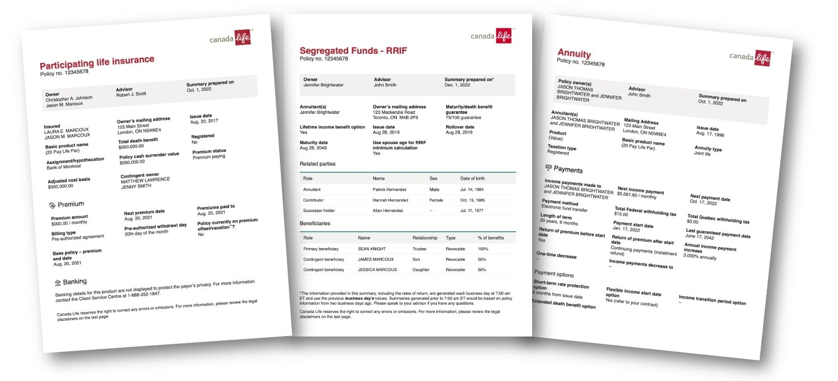
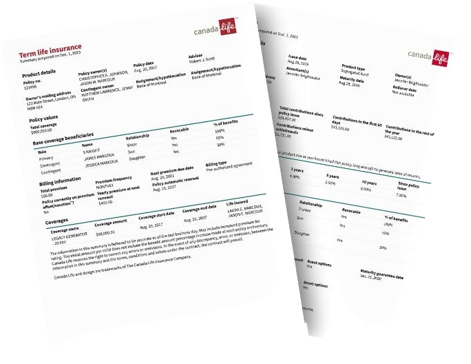
Version 1 shipped across the product lines with one shared, branded template — participating life insurance, segregated funds RRIF, and annuity.
Goals
- Understand the current pain points and needs with product print summaries.
- Understand users' expectations when exporting a policy summary, and the needs for a portfolio summary.
Methodology
- Six remote interviews were run from the London office with advisors and operational staff across Canada.
- Each session was scheduled for 30 minutes, including interview questions and open discussion.
Too many white spaces
These Version 1 summaries were designed with a page break after each section. Each section needed specific legal and disclaimers, which left pages holding only a few lines of copy, followed by white space and legal.
Too long
Because of the above, print summaries could run up to eight pages. That is a lot of pages for advisors to print and prepare for their clients.
The professional approach was appreciated
Aside from the length, these summaries were well received. It was resolved to take steps to reduce the page count as a top priority.
The updated product details UI was a good opportunity to further enhance the summaries, and roll out both sets of new features at a similar time.
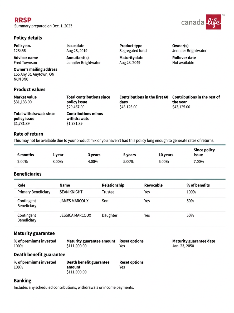
Updates
- Removed non-essential labels as advised from interviewees.
- Created a new section to prioritize the most important information at the top of the page.
- Much shorter — from eight pages to two.
- Continues to be professional, with a client ready approach.
Shorter is better
Advisors don't want to waste paper when preparing summaries for clients. Page count was the single loudest piece of feedback across both rounds.
Remove non-essential information
These documents are shared with a client, so not all information is needed on the printed page.
Workspace holds the rest
Any remaining information can be found in Workspace, so the summary can stay focused on what the client needs to see.
Branded and consistent
A professional, Canada Life branded, design-system adherent content library is important to how these documents land with clients.
Keep evolving post MVP
It is important to continue to evolve and make enhancements after MVP, rather than treating Version 2 as the finish line.
Outcome
One branded summary, in one place, cut from eight pages to two — and a clear roadmap of enhancements still ahead.